Hi Care
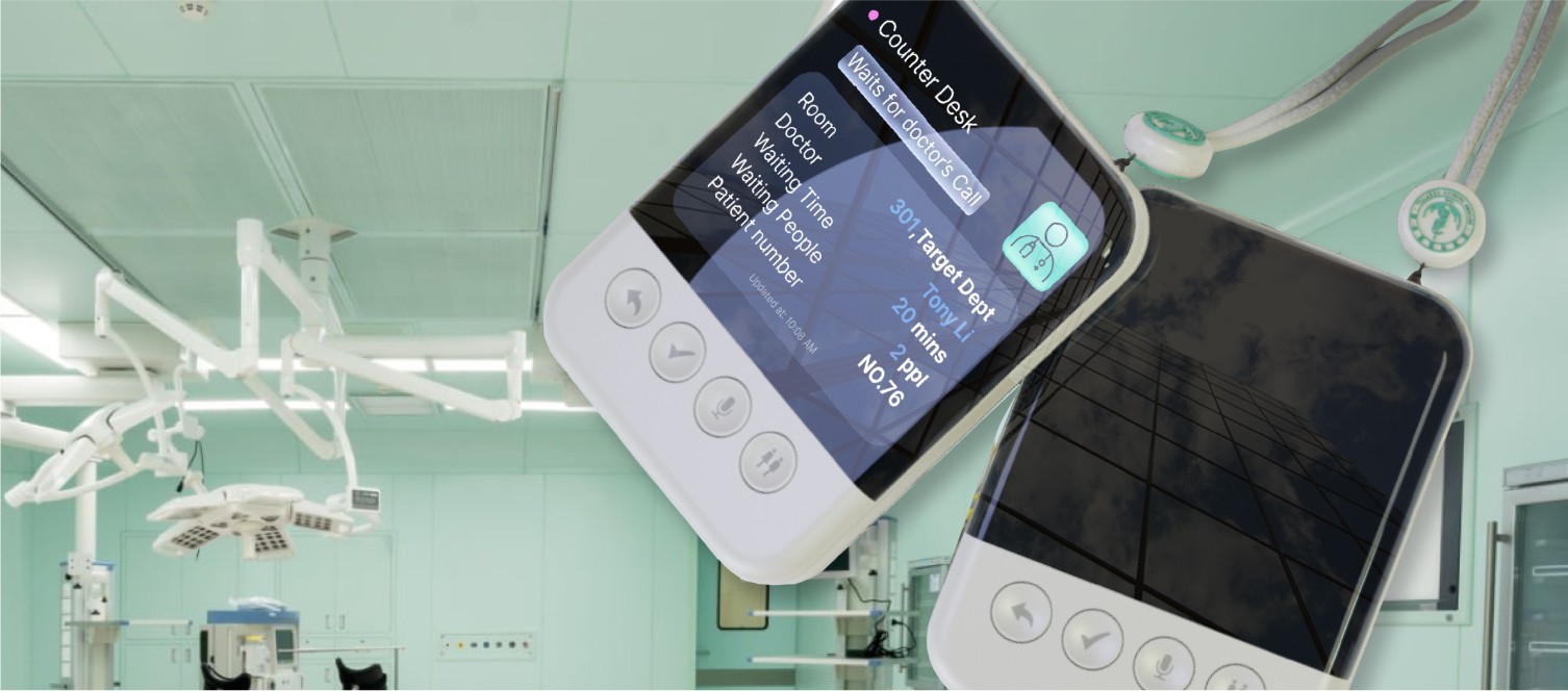
HiCare is a portable navigation device with a screen to help patients navigate the hospital easily and facilitate a smoother procedural experience.
UX Research, UI/UX Design, Product Design, Servise Design, Signage Design
2023 Fall- 2023 Winter
UX Research, UI/UX Design,
Group Project
Why Project?
Poor healthcare condtions in Haidian Hospital
Haidian Hospital is a community hospital located in Beijing, China. Due to the outdated construction of the building and the complex healthcare procedures, the medical experience at the hospital is perceived poorly. Many patients are unable to follow the correct medical procedures on time, resulting in inefficient medical experiences, getting lost, and feelings of confusion.
How did we Achieve it?
How can we improve the overall healthcare experience in Haidian Hospital?
Design Solution
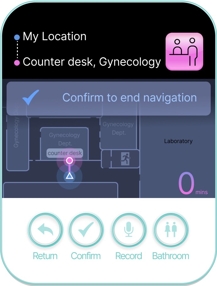
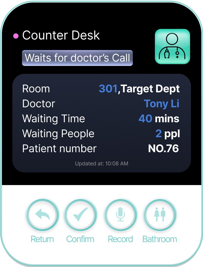
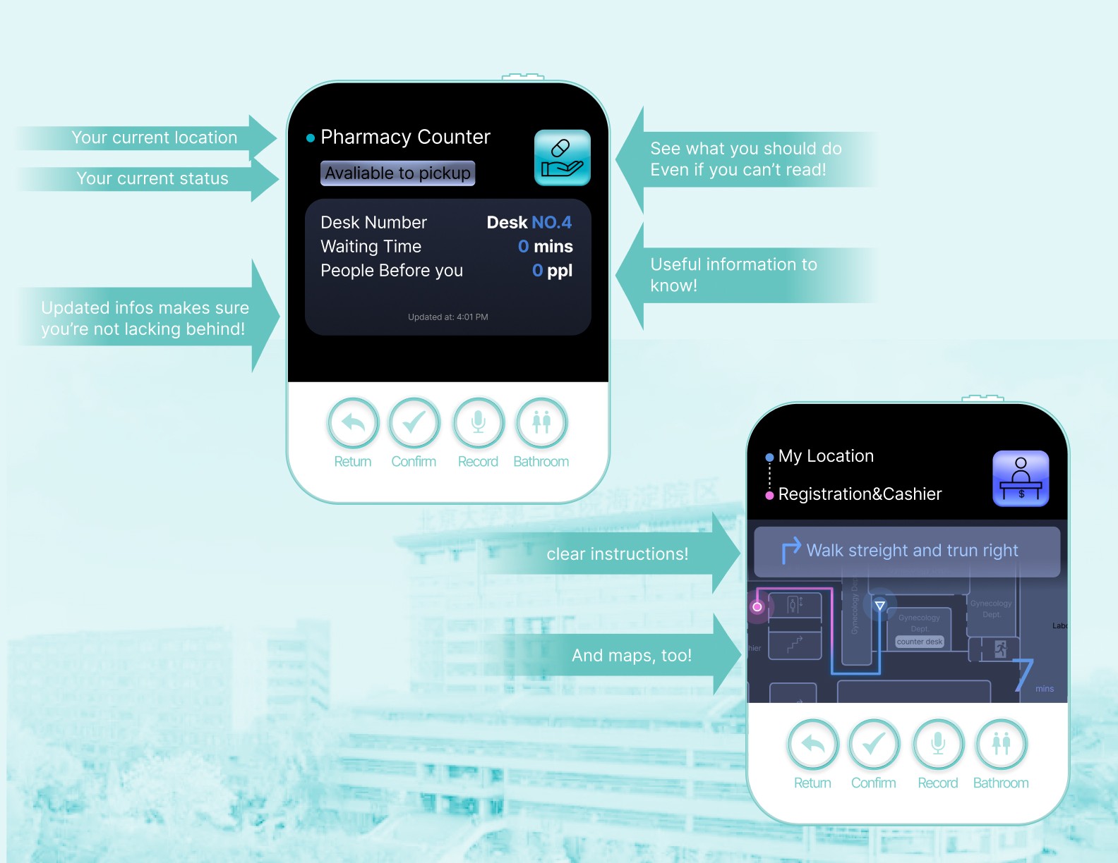
The user can follow the guidance to walk from the registration desk to the counter desk of their specific department.
Navigate to counter desk
The user can follow the guidance to walk from the registration desk to the counter desk of their specific department.
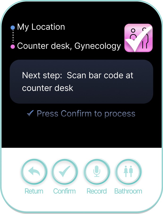
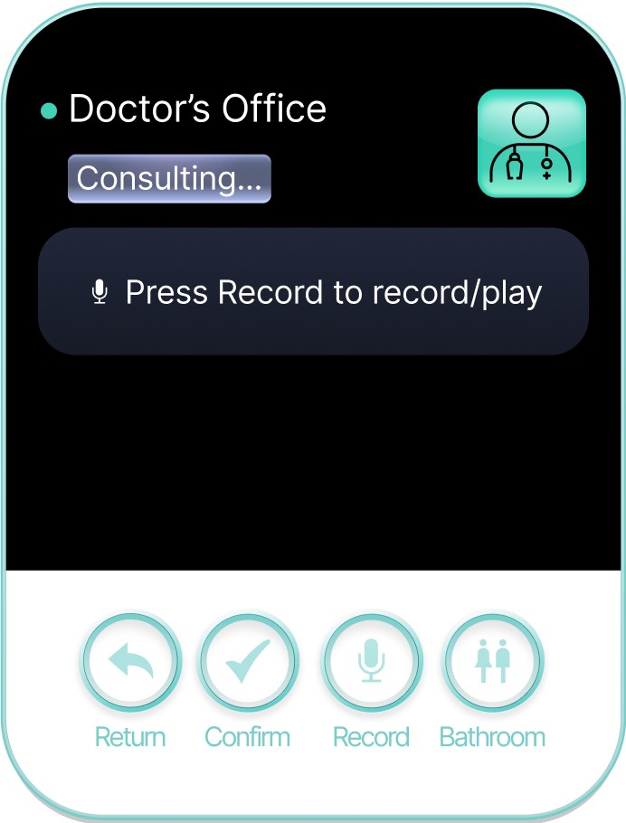
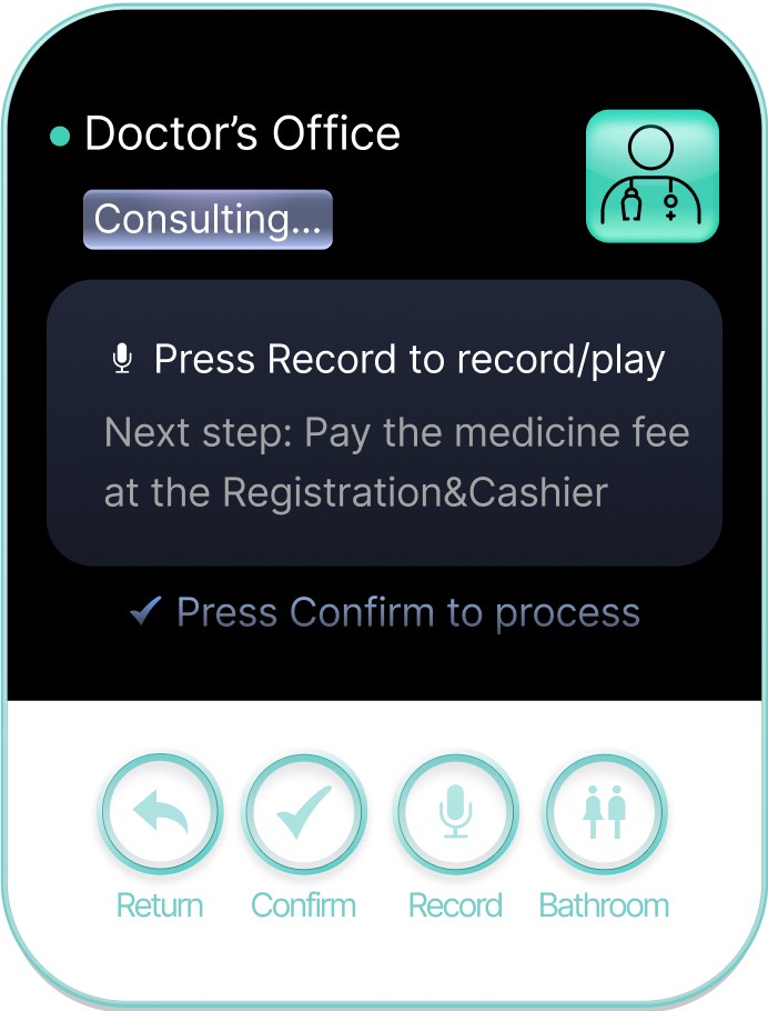
Doctor’s Office
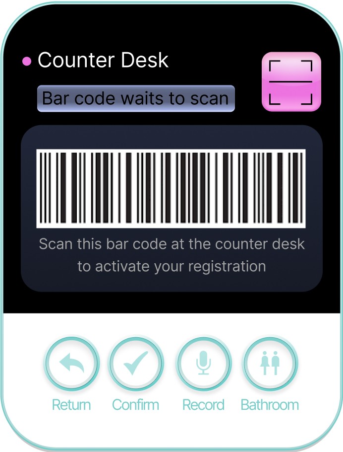
The user can navigate from the counter desk to the doctor’s office after signing in at the counter desk.
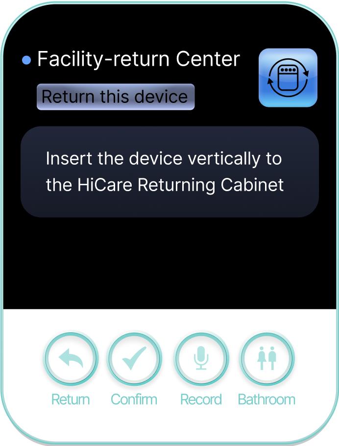
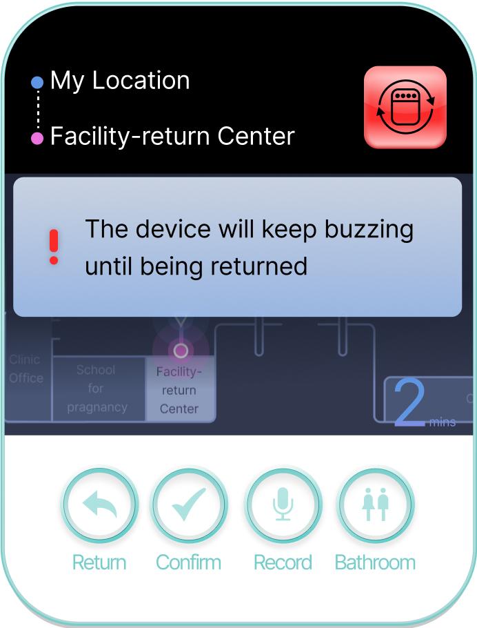
Return The Hi Care
Hi Care will turn red, buzzing, and turn on alarm when the user did not return it.
Hierarchies and Function
Product Design - HiCare and HiCare Return Cabinet
Our Research
Field Survey (113 responses)
We distributed 160 paper surveys to patients at the hospital. The questions focus on patients' evaluations of their medical experiences at the hospital, any difficulties they encountered, and whether they were new patients, among other information. We received 113 valid responses and have created a survey results analysis report based on the answers received.
Field Observation
To minimize the discrepancy between the collected data and the actual situation, I went to the Haidian Hospital to register and seek medical treatment, recording the difficulties encountered along the way and the settings observed that might confuse patients
Affinity Map
I created an Affinity Map based on tthe interview results.
Procedure Compile
I compiled a hospital medical procedure chart to reference when designing the navigation process.
Interesting Findings!
I found out that Misdirecting signals, Inefficient communication, a lack of experience and awareness, a Poorly designed notification system, and a Limited ability to operate common technical products are the three crucial problems that lead to patients’ low satisfaction with Haidian Hospital’s healthcare experience.
Design Process
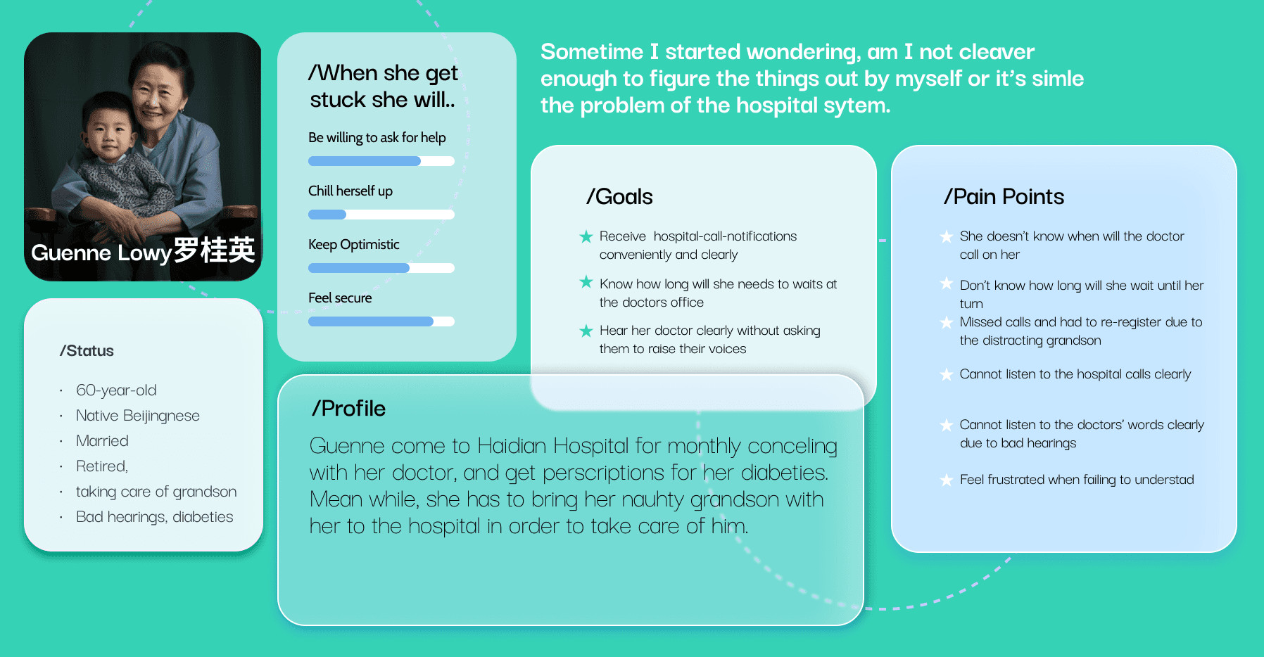
Our Users: Personnas
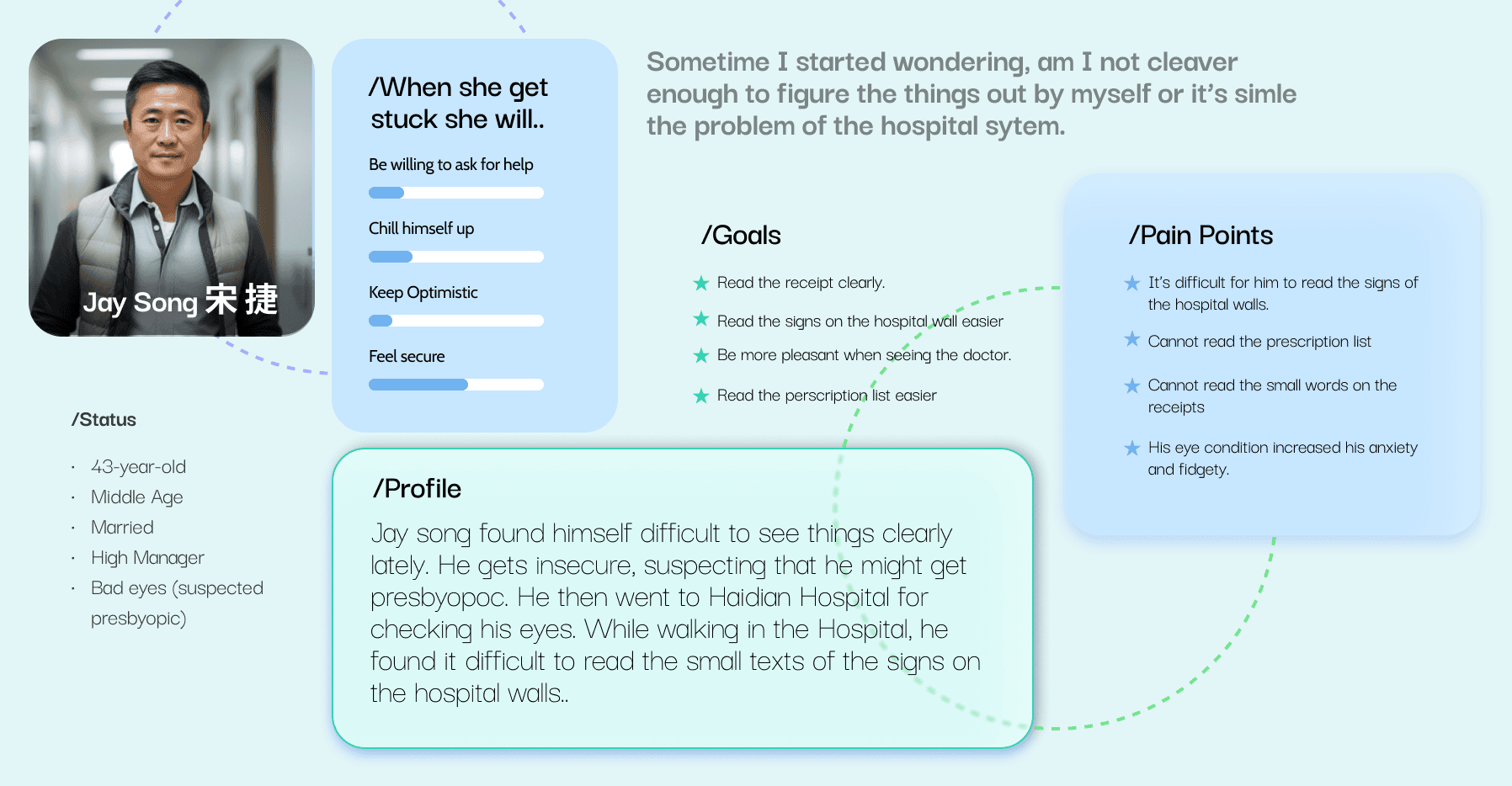
Based on our findings, we created three basic personas to think from the patient's perspective. They are Guenne, a 60-year-old frequent patient, Shuning, a 26-year-old new patient, and Jay, a 43-year-old new patient.
Prototypes
Journey Map
A User Journey Map helps me to deeply understand the user's feelings throughout their journey, the highs and lows of their experiences, the challenges and pain points they encounter, and how they respond to these challenges.
Product Design
Product Design Ideation
I then explored the currently available medical electronic products for patients on the market to seek inspiration.
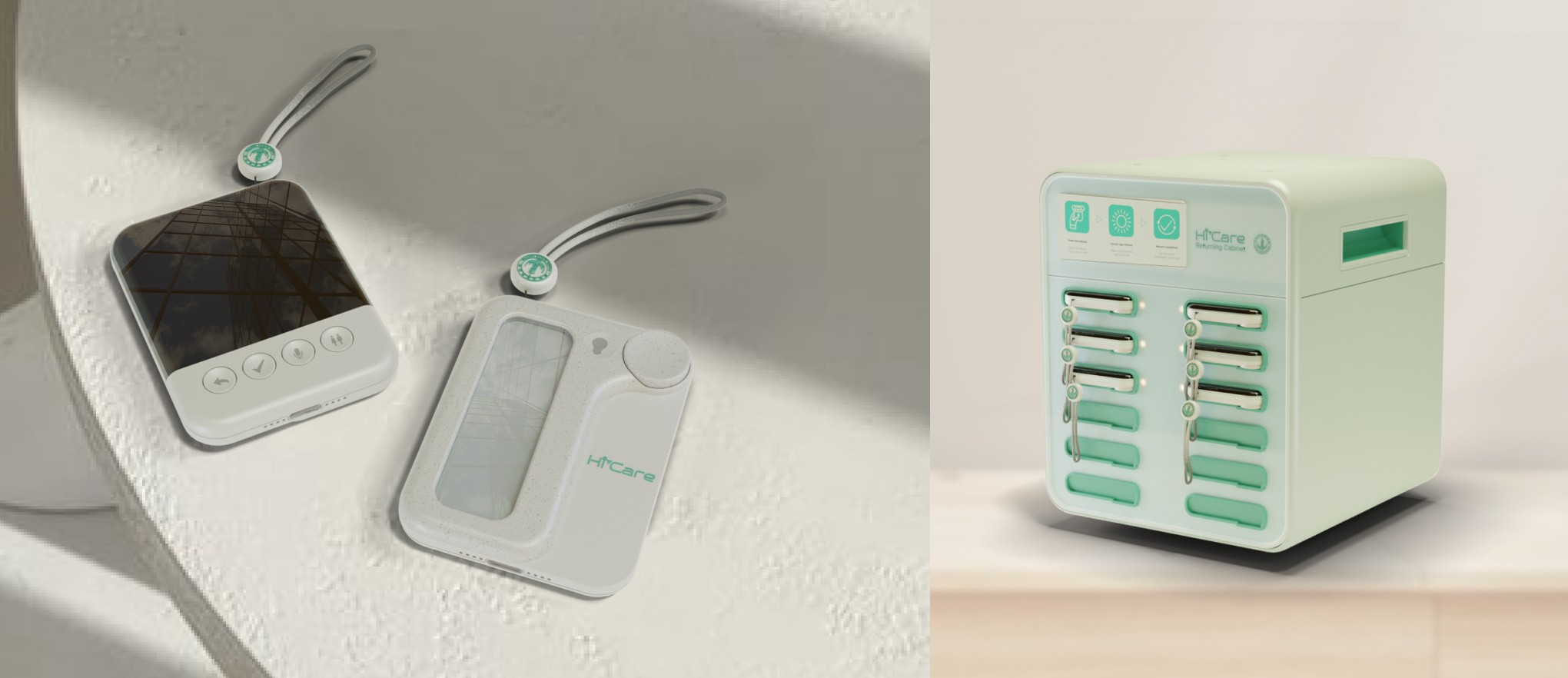
The product of HiCare
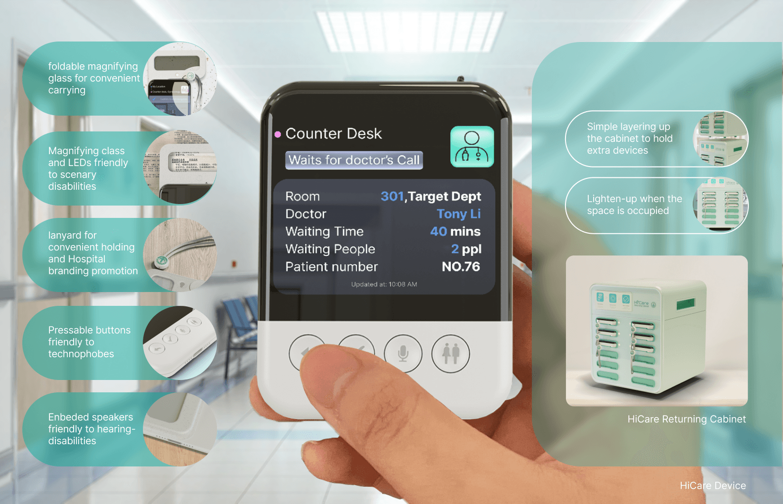
Therefore, I designed the HiCare product. Compared to traditional app interface design, the product is more user-friendly for those who are not accustomed to using electronic devices. I equipped it with physical buttons, reduced the number of buttons, and designed a foldable magnifying glass, amplifier, and lanyard to enhance the product's accessibility. I also designed a returning cabinet to facilitate user pickup and recycling.
Prototype!
Mid and High Fidelity Prototypes
Mid-fidelity prototype brings a more refined representation of the final product without the full detail of high-fidelity prototypes. High-fidelity prototypes closely resemble the final product, including detailed visual designs, interactions, and functionality.
Signage Design
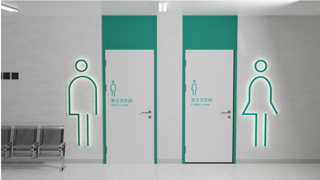
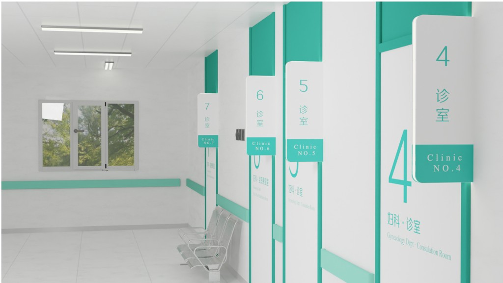
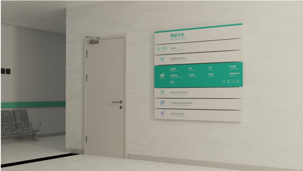
Redesigned a set of signage to replace the existing outdated system.
To enable patients to easily identify their location within the hospital and receive clearer on-site navigation assistance, we redesigned a set of signage to replace the existing outdated system. Larger text, clearer fonts, more consistent department & room names, and color coding by floor help patients understand their position at a glance.
Reflect Upon
Illiterate patients have not been considered!
While efforts have been made to accommodate visually impaired groups through icons and enlarged characters, illiterate users will still encounter barriers in use. Could we possibly use clickable text that plays audio and add more detailed signage images to help illiterate patients understand what the product is saying?
